
Classic Wedding Signs
Formal serif type, elegant monograms, and a timeless palette define our classic wedding signs, a refined set that carries one polished design across every sign in your day, from the welcome sign and seating chart to the ceremony, directional, cocktail hour, reception, and parking signs. Each is fully editable in our free browser-based editor and downloads at both 24x18 and 36x24 inches. Filter by style below.




About Our Classic Wedding Signs
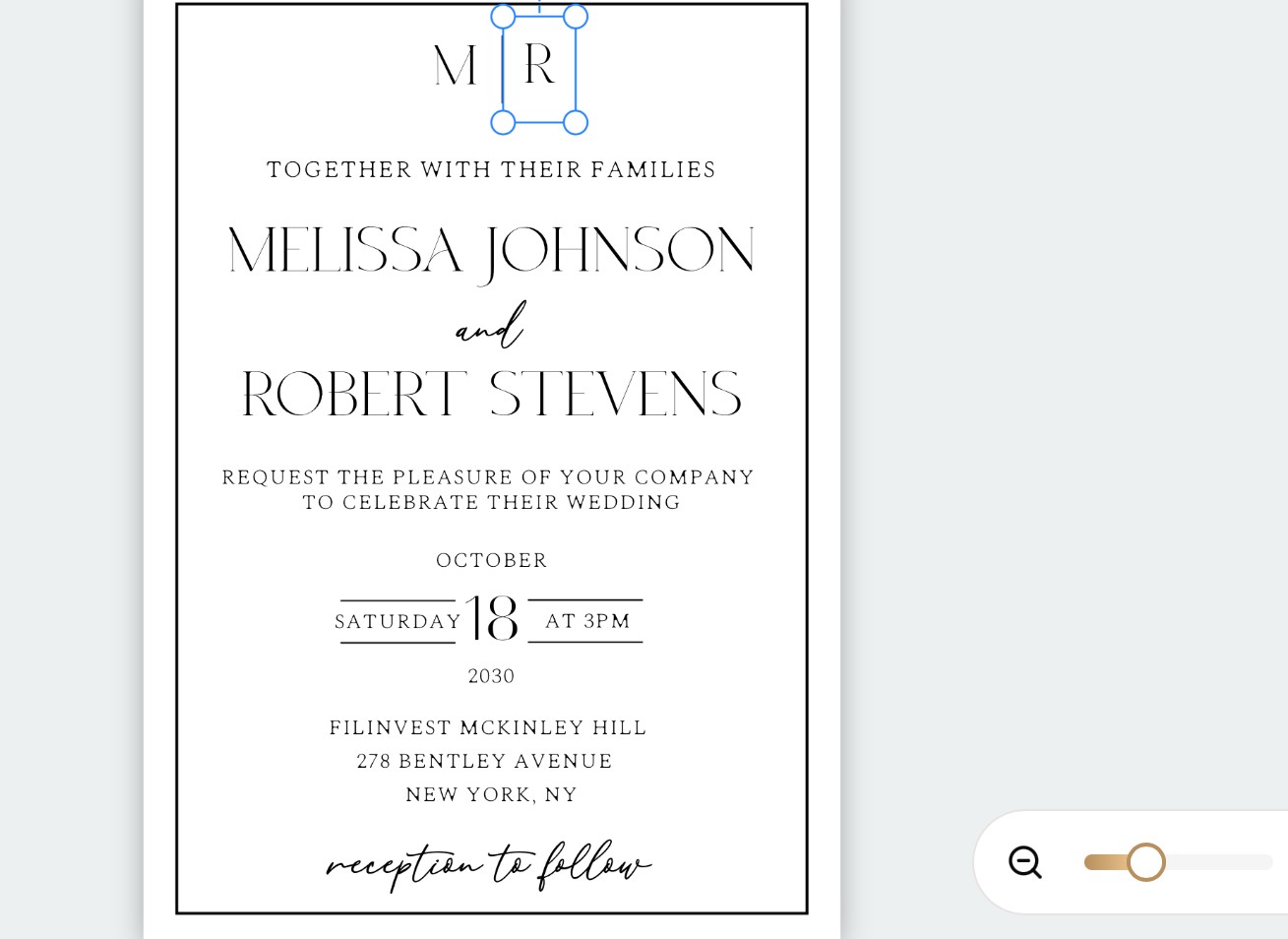
Our classic wedding signs carry one refined, timeless design across every sign your day needs, built on formal serif type, an elegant monogram, and a restrained palette. The set spans the whole bundle: the welcome sign at the entrance, the seating chart, ceremony signs, directional signs, cocktail hour signs, reception signs, and parking signs, all sharing the same polished look, at home in a ballroom, country club, hotel, or estate. No Canva account, no Photoshop, no software to install. Customize the wording, your names and monogram, colors, and layout on each sign in your browser, then download print-ready files at both 24x18 and 36x24 inches. A coordinated classic set is the kind of detail guests expect at a formal wedding, so the signage does double duty, guiding your guests while lending the whole day a sense of occasion from the entrance to the last table.
A Monogram and Formal Serif Across Every Sign
What makes the set read as classic is one formal design language carried across a wide range of sizes and jobs. The defining elements are a refined serif or calligraphy typeface, a monogram or crest, a centered and symmetrical layout, and a restrained palette of ivory, navy, black, and gold. The monogram is the thread that ties the set together: on your two biggest pieces, the welcome sign and the seating chart, it anchors a full, elegant composition guests photograph and gather around, and on the smaller pieces, a directional sign or a little cocktail hour sign, the same monogram sits quietly in a corner so every sign clearly belongs to the same wedding. The typeface, palette, and monogram stay identical across all seven; only the scale changes to fit each piece, so the whole day reads as one considered, formal design.
The Frame Makes It Formal: Materials and Display
With classic signs, presentation does much of the work, and this is where the style pulls ahead of the others. The same message printed on ivory cardstock and set in a real gold or ornate frame on a proper easel looks bespoke and expensive, where a bare board would not. The design supplies the formality, the serif type, the symmetry, the monogram, and the restrained palette, and the frame supplies the presentation. Because most of these are indoor easel signs, choose the material to suit each one: an ivory or soft-white heavy cardstock in an ornate frame is the classic choice for the smaller signs, foam board in a matching frame suits a larger sign on a floor easel, and acrylic or a framed mirror makes an elegant statement piece for the welcome sign or seating chart. Keep the frames consistent across the set so the whole room looks coordinated and deliberate. The one exception is the parking sign, which lives outdoors and prints on weatherproof corrugated plastic on a lawn stake instead; build the formal look into the print with an ivory ground, navy or black serif type, and a small crest, so it reads as polished as the rest without the frame. Print at a shop for the big framed pieces and at home for the small ones, and hold the same type, palette, and monogram across all seven so the whole day coordinates.
Pairs With
Browse the full wedding signs bundle in every style. For the matching individual classic pieces, see our classic wedding welcome signs, classic wedding seating charts, and classic wedding ceremony signs. For the tabletop paper goods in the same style, add the Wedding Day Stationery bundle.
Frequently Asked Questions
What signs come in the classic style?
The classic bundle covers all seven signs in one refined, formal design: a welcome sign, a seating chart, ceremony signs, directional signs, cocktail hour signs, reception signs, and parking signs. Each shares the same serif typeface, monogram, and restrained palette, so every sign from the entrance to the reception reads as one wedding. Every sign is fully editable in the free editor and downloads at both 24x18 and 36x24 inches.
Can I add our monogram or initials to the signs?
Yes. Every sign in the bundle is built to carry a monogram, and you can add or edit your initials, names, and even a small crest in the free editor. Because the monogram repeats across all seven signs, it becomes the thread that ties the set together, from the welcome sign at the entrance to the seating chart and the smaller signs through the day. You can also adjust the typeface and palette so the monogram matches the one on your invitations.
What fonts and colors work for classic wedding signs?
A refined serif or a formal calligraphy typeface is the heart of the classic look, in a restrained palette of ivory, navy, black, and gold, kept symmetrical and uncluttered. A monogram or crest and a gold-tone accent add the sense of formality without crowding the wording. Keep the type doing the work rather than heavy ornament, and let a real or ornate frame supply the finish on the larger signs. Using the same typeface, palette, and monogram on all seven signs is what keeps the set unified.
Do classic wedding signs match the rest of my stationery?
Yes. The classic signs share a design language with our classic invitation suite and day-of stationery, so your welcome sign and seating chart coordinate with your menus, place cards, and table numbers. If your invitations featured a formal serif, a monogram, or gold accents, carry the same through the signs. Buying your signage in one classic style is the simplest way to make the whole wedding read as one elegant, timeless design.