
Minimalist Wedding Day Stationery
Clean typography, generous white space, and a restrained palette define our minimalist wedding day stationery. This five-piece set brings a modern, uncluttered look to every table: the ceremony program, place cards, dinner menu with a thank-you note on the reverse, bar menu, and table numbers, all in one coordinated design. Fully editable in our free browser-based editor and printed on cardstock at home or a local shop. Filter by style below.




About Our Minimalist Wedding Day Stationery
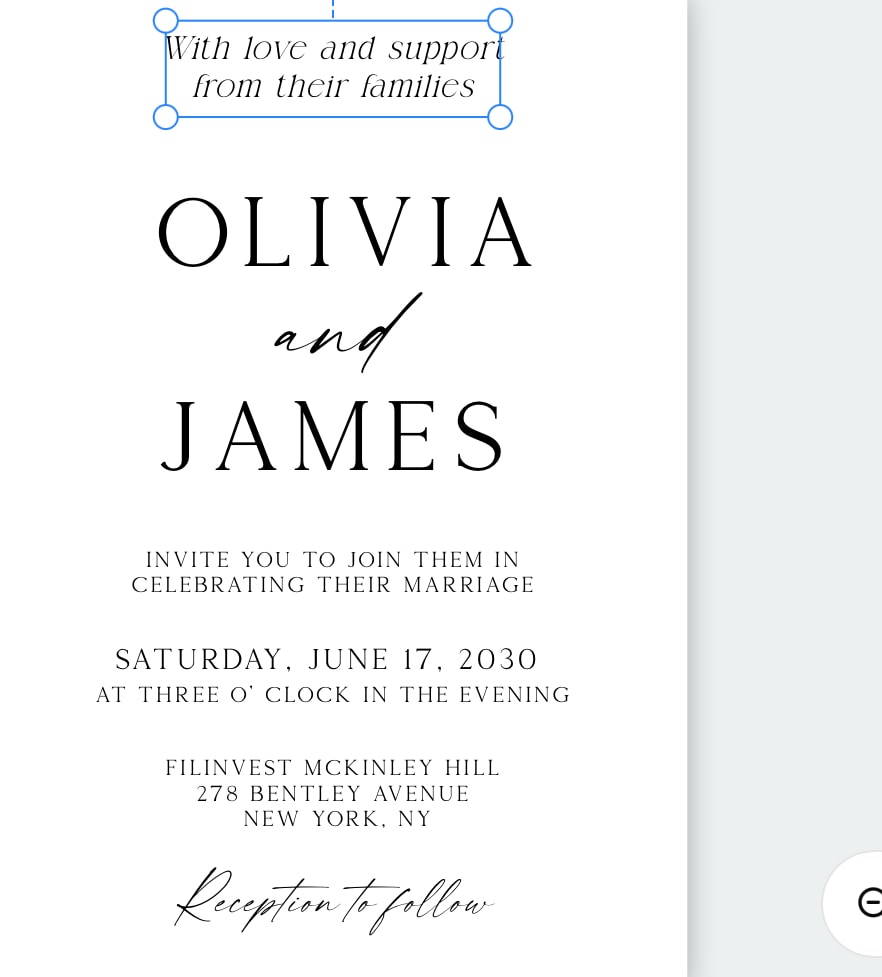
Our minimalist wedding day stationery set is built on the idea that less, done well, reads as more. Clean typography, generous white space, and a tightly restrained palette give the whole reception a calm, modern, considered feel. The set covers all five day-of pieces in one coordinated design: the ceremony program, place cards, the dinner menu with a thank-you note on the reverse, the bar menu, and the table numbers. No Canva account, no Photoshop, no software to install. Customize the wording, your names, colors, and layout on each piece in your browser, then download print-ready PDF, JPEG, and PNG files. Every piece prints on cardstock at its own size, so this is tabletop stationery with no signs or easels to manage.
How Minimalism Reads Across the Five Pieces
What makes a minimalist suite work is that restraint is applied differently to each piece, because each does a different job. Across the set:
Program: clear section hierarchy with consistent spacing instead of borders or dividers, so the order of service reads top to bottom without visual clutter.
Place cards: just the name in a confident typeface, centered, with plenty of margin. On such a small card, white space is the entire design.
Menu: course titles in a slightly heavier weight, descriptions in a lighter one, generous line spacing. The hierarchy does the work a graphic would.
Bar menu: drink names listed cleanly, one accent rule or a single small icon at most, nothing competing with the type.
Table numbers: one large numeral, sharp and centered. This is minimalism at its most literal, and it photographs beautifully.
A Tight Palette Holds the Suite Together
Minimalist stationery lives or dies by its palette, and the discipline is to keep it small. Black or charcoal on white or ivory is the classic base, usually with a single soft accent such as sage, taupe, dusty blue, or a warm neutral, carried identically across all five pieces. High contrast keeps the menu and place cards legible, while a soft neutral background reads calmer than stark white in a warm-toned venue. Because the palette is small and the design is uncluttered, matching every piece exactly is effortless in the free editor, and the pieces double as quiet minimalist wedding table decor rather than fighting the flowers and linens for attention. If you want one moment of warmth, a small monogram or a single hairline rule in a metallic ink is enough without breaking the restraint.
Pairs With
Browse the full wedding day stationery bundle in every style. For matching minimalist signage, see our minimalist wedding ceremony signs, minimalist wedding welcome signs, and minimalist wedding seating charts. The Wedding Signs (7-Piece) bundle adds the large signs in the same minimalist look.
Frequently Asked Questions
What is included in the minimalist wedding day stationery set?
Five coordinated pieces in one minimalist design: a ceremony program, place cards, a dinner menu with a thank-you note on the reverse, a bar menu, and table numbers. Each carries the same clean typography and restrained palette, so the ceremony and every reception table read as one modern suite. Every piece is fully editable in the free editor and downloads at its own print size on cardstock.
How do I keep a minimalist menu and program from looking plain?
Minimalist is not the same as empty. The look comes from disciplined typography rather than decoration: one or two typefaces, clear hierarchy, and generous margins so the wording has room to breathe. On a menu, set the course titles in a slightly larger weight and the descriptions in a lighter one. On a program, use consistent spacing between sections rather than lines or borders. A single restrained accent, one hairline rule, one small monogram, or one ink color, is usually enough. The elegance comes from what you leave out, not from filling the space.
What colors work best for minimalist wedding stationery?
Minimalist suites lean on a tight palette: black or charcoal on white or ivory is the classic base, often with a single soft accent such as sage, taupe, dusty blue, or a warm neutral. Keep the same one or two ink colors across all five pieces so the tables stay cohesive. High contrast keeps the type legible on the menu and place cards, while a soft neutral background reads calmer than stark white if your venue is warm-toned. Because the palette is small, matching it exactly across the program, place card, menu, bar menu, and table number is easy in the free editor.
Should my minimalist day stationery match my invitations?
Yes. Matching keeps the whole wedding visually consistent. If your invitations were minimalist with black-on-white type and a single accent, carry the same typeface, accent, and spacing into the day-of pieces so guests recognize the design from save-the-date to table number. Minimalist day stationery also coordinates naturally with minimalist ceremony signs, welcome signs, and seating charts in the same type system, which is why many couples buy the invitation suite and the day-of set together to hold one design language across the entire wedding.