
Minimalist Wedding Reception Signs
Clean typography, generous space, and a restrained palette define our minimalist wedding reception signs, a quiet, modern set that keeps your reception looking intentional. Covers all the small signs a reception needs: cards and gifts, unplugged, guestbook, in loving memory, favors, and the send-off, in one coordinated look. Every sign is fully editable in our free browser-based editor and downloads at both 24x18 and 36x24 inches for easel display. Filter by style below.



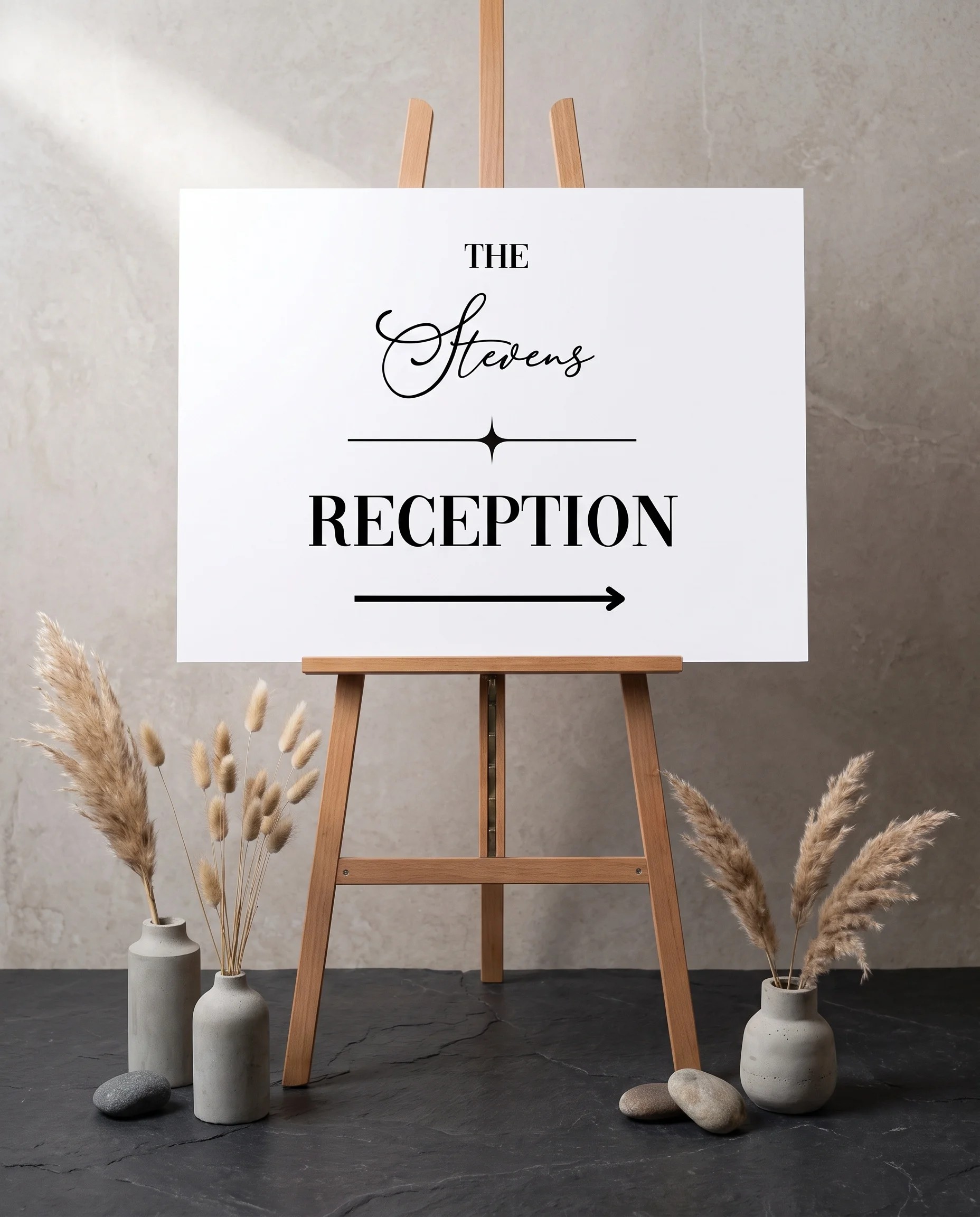
About Our Minimalist Wedding Reception Signs
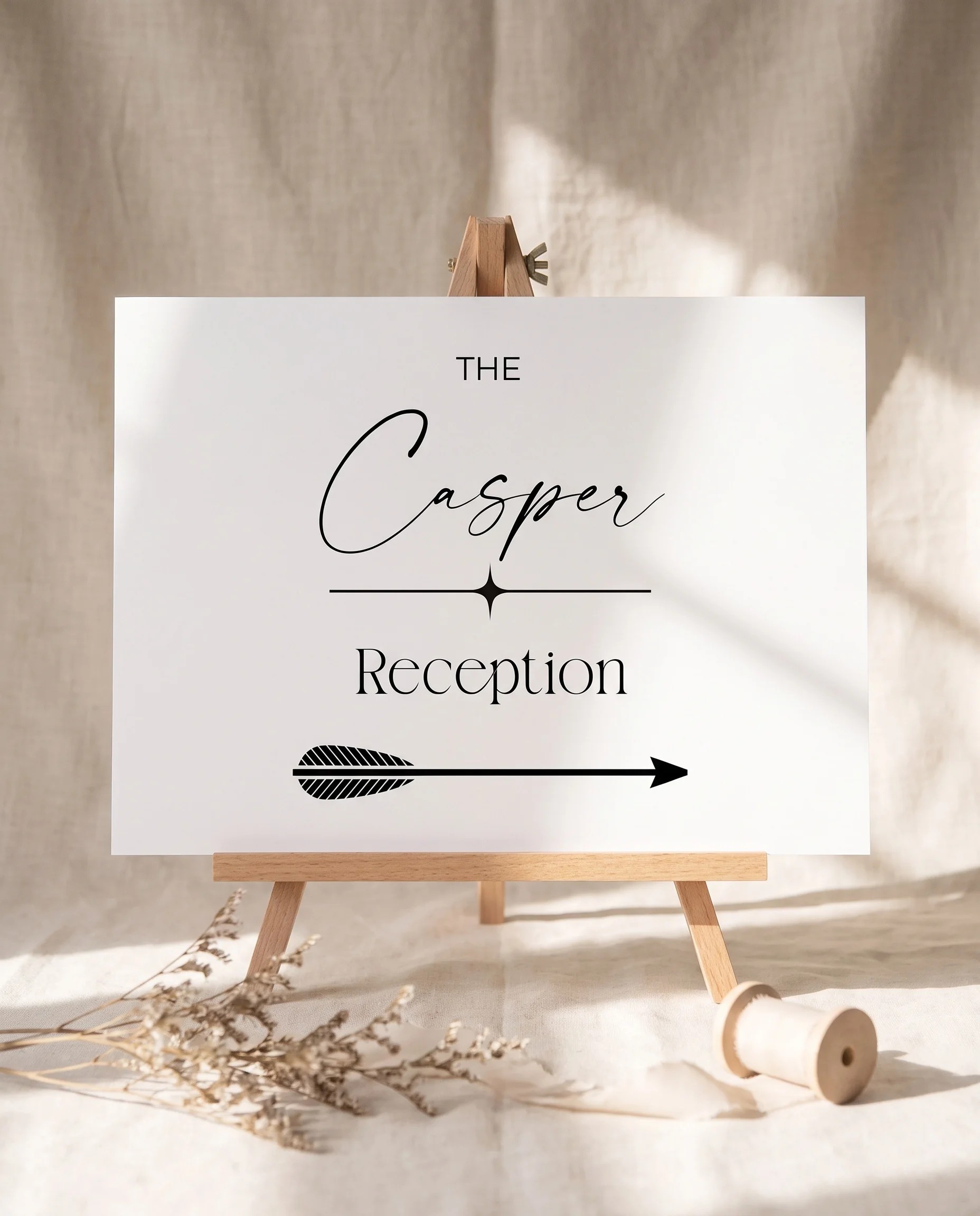
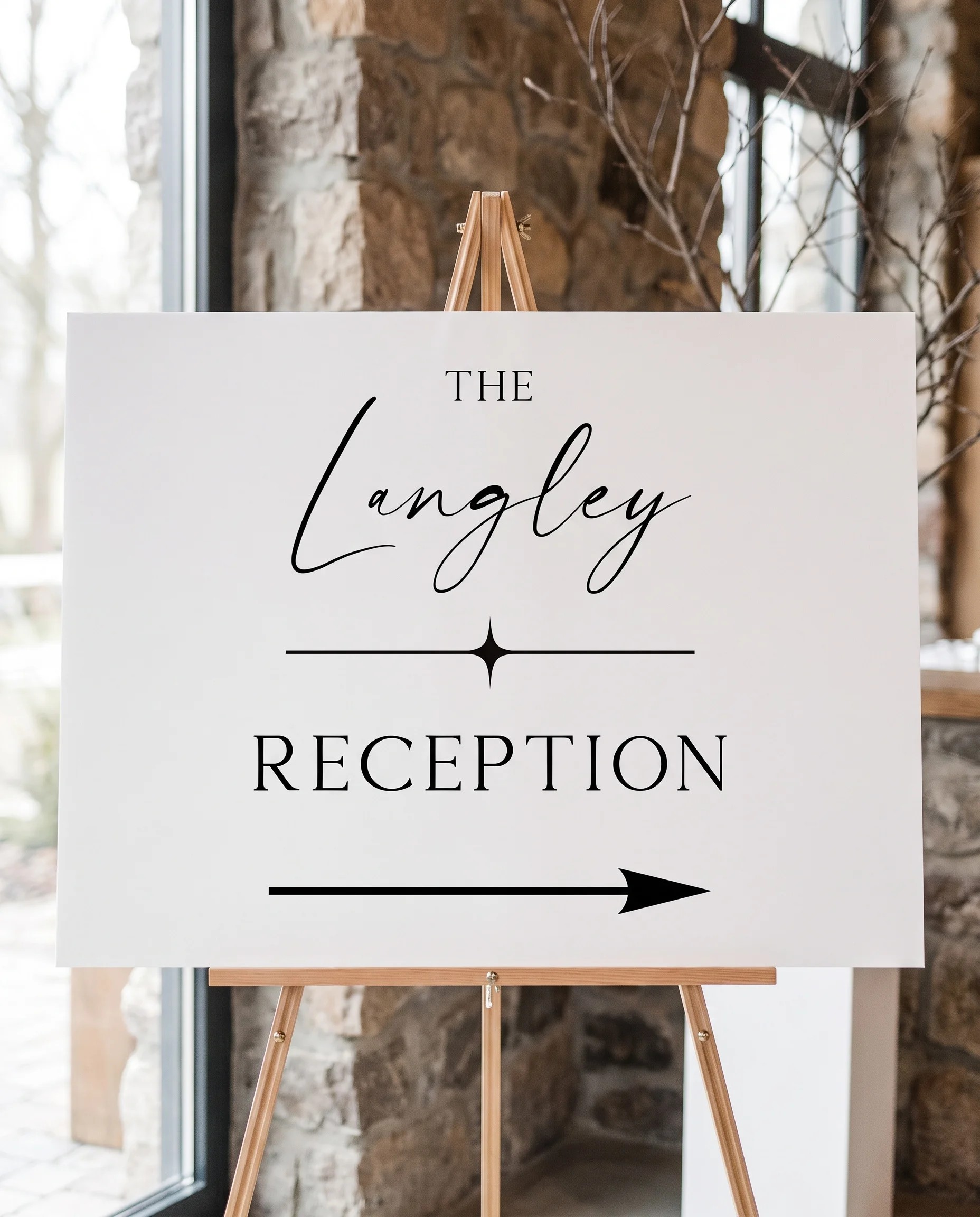
Our minimalist wedding reception signs bring clean typography, generous space, and a restrained palette to every small sign your reception needs. A reception is full of little messages, where to leave cards and gifts, a note to unplug, the guestbook, a tribute to loved ones, favors at the door, the send-off, and the minimalist approach keeps them all quiet, modern, and unmistakably part of one wedding. The collection covers cards and gifts, unplugged, guestbook, in loving memory, favors, send-off, and a custom option, each fully editable in our free browser-based editor. No Canva account, no Photoshop, no software to install. Customize the wording, your names, colors, and layout, then download print-ready files at both 24x18 and 36x24 inches for easel display.
One Quiet System Across Every Sign
The real value of a minimalist reception set is not any single sign, it is how the whole group holds together. A reception scatters signs across the room, on the gift table, the guestbook table, the bar, the exit, and if each one has a different font or color the space starts to feel cluttered even when every sign is pretty on its own. Minimalist reception signs solve that by running the same restrained system through all of them: one typeface, one alignment, one or two colors, and plenty of white space on every sign. A guest reads cards and gifts here, unplugged there, and favors at the door, and registers them all as clearly the same wedding. Restraint is what turns a dozen small, wordy pieces into a single calm, coordinated look, which is exactly the job minimalism does best. Keep each sign to one clear message with a simple title-and-detail hierarchy, and let the consistency across the set do the rest.
A Tight Palette and the Right Materials
Hold the palette to a minimalist base, black or charcoal on white or ivory, with at most a single soft accent such as sage, taupe, or dusty blue, and use the same one clean typeface, a modern serif or a simple sans-serif, on every sign. High contrast keeps each sign legible across the room, and generous margins are what make the look read as deliberate rather than sparse. Because these signs are displayed indoors on an easel, you can choose the material to suit each sign: cardstock (110lb) in a slim frame suits the smaller tabletop signs like cards and gifts or guestbook, foam board is light and inexpensive for a larger sign on a floor easel, and acrylic gives a clean, modern edge that especially suits the minimalist style for a statement piece. A minimalist set doubles as quiet minimalist wedding decor, holding the room together without competing with the flowers, the table settings, or the light. Print at home on cardstock, or send the files to a print shop for foam board and acrylic.
Pairs With
Browse all wedding reception signs by aesthetic. For matching minimalist signage, see our minimalist wedding welcome signs, minimalist wedding seating charts, and minimalist wedding ceremony signs. The Wedding Signs (7-Piece) bundle includes the large signs in the same minimalist look.
Frequently Asked Questions
What reception signs come in the minimalist style?
The minimalist collection covers all the small signs a reception needs, each in the same clean design: cards and gifts, unplugged, guestbook, in loving memory, favors, send-off, and a custom option for any other message. Because they share one restrained typeface and palette, the whole set reads as a single, intentional design rather than a mix of separate signs. Every one is fully editable in the free editor and prints at both 24x18 and 36x24 inches.
How do I keep a dozen small reception signs from looking messy?
This is exactly what a minimalist set solves. A reception has many small signs scattered across the room, on the gift table, the guestbook table, the bar, the exit, and if each one has a different font or color, the room starts to feel cluttered. Minimalist reception signs use the same typeface, the same alignment, and the same one or two colors on every sign, so a guest reads cards and gifts, unplugged, and favors as clearly part of one wedding. Restraint is what ties a large number of small pieces together into a calm, coordinated look.
What colors and fonts work for minimalist reception signs?
Keep the palette tight: black or charcoal on white or ivory is the classic minimalist base, often with a single soft accent such as sage, taupe, or dusty blue. Use one clean typeface, a modern serif or a simple sans-serif, in a clear hierarchy, with the sign's title larger and any detail smaller. Plenty of white space around the wording is what makes it read as deliberate rather than sparse. Use the same colors and font on every reception sign so the set stays unified, which is easy to do in the free editor.
Do minimalist reception signs match the rest of my stationery?
Yes. The minimalist reception signs share a design language with our minimalist invitation suite and the rest of the minimalist day-of signage, so your cards and gifts and guestbook signs coordinate with your welcome sign, seating chart, menus, and table numbers. If your invitations were clean black-on-white type, carry the same typeface and accent through the reception signs. Buying your signage in one minimalist style is the simplest way to make the whole wedding read as one calm, modern design.