
Minimalist Wedding Parking Signs
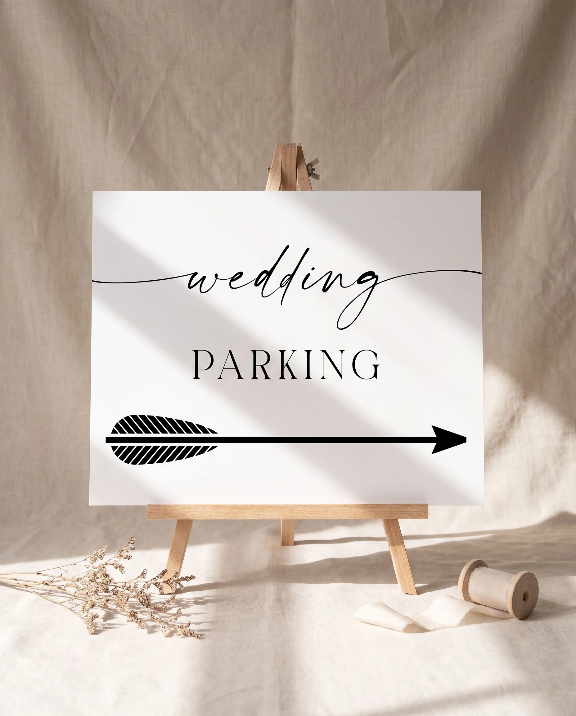
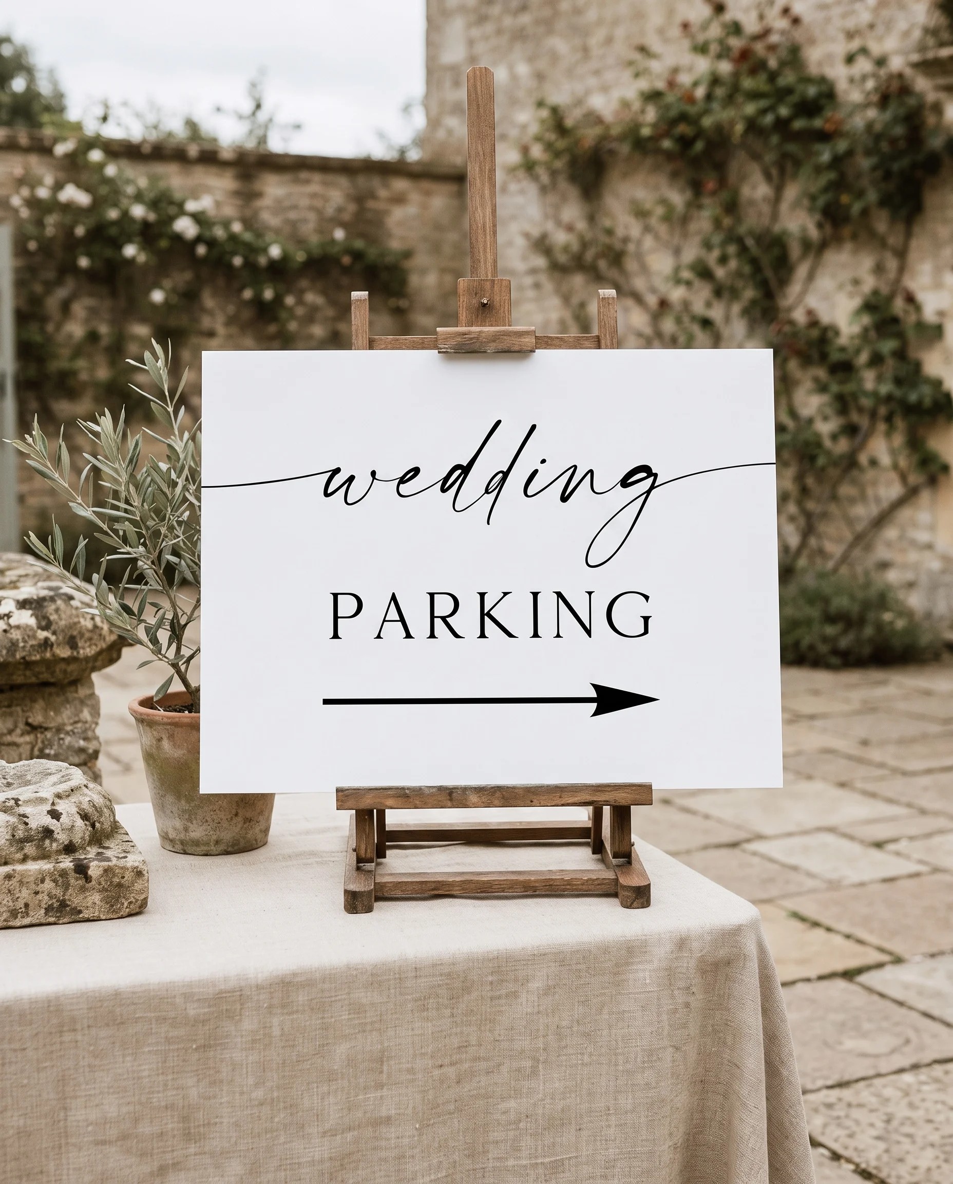
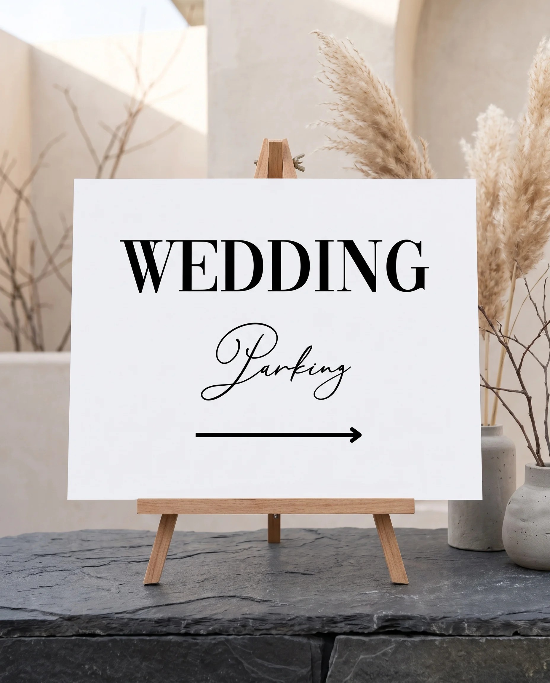
Clean type, bold arrows, and high contrast define our minimalist wedding parking signs, built to be read from a moving car at a glance. Choose from guest parking signs, reserved signs, valet signs, directional arrows, and no-parking signs, all in one modern, uncluttered design. Available at both 24x18 and 36x24 inches on a single file, ready to print on weatherproof coroplast for a lawn stake. Fully editable in our free browser-based editor. Filter by style below.



About Our Minimalist Wedding Parking Signs
Our minimalist wedding parking sign templates are built around a single principle: a parking sign has to be read instantly, often from a moving car, and clean type does that better than anything else. Stripped-down lettering, a bold arrow, and high contrast give guests the message in the second or two they actually have. The set covers the whole lot: guest parking signs at the entrance, reserved signs for the couple and family, valet signs, directional arrows, and no-parking signs. No Canva account, no Photoshop, no software to install. Customize the wording, the couple's names, colors, and layout in your browser, then download print-ready files. Every design downloads at both 24x18 and 36x24 inches on a single file, ready to print on weatherproof coroplast for a lawn stake.
Why Minimalism Is the Most Functional Choice on the Lot
On most stationery, minimalism is an aesthetic preference. On a parking sign it is a functional advantage, which makes this the one place the style earns its keep twice over. A driver rolling into an unfamiliar lot has a second or two to read a sign, so the design that wins is the one with the least to process: a large sans-serif word like “Parking,” one clear arrow, and nothing else. A decorative or busy sign forces the driver to slow down and hunt for the message, which is the opposite of what you want at the entrance. The restraint that defines the minimalist look, generous space, a tight palette, one confident typeface, is exactly the recipe for a sign that reads at a distance. Keep each sign to one instruction: guest parking here, reserved for family, valet this way. If a sign is pointing somewhere, let the arrow do the work and cut the words down to the essential.
High Contrast and a Weatherproof Print
Two things make a minimalist parking sign work outdoors: contrast and material. On contrast, black or charcoal type on a white or ivory ground is both the most minimalist and the most legible, reading in bright sun and low light alike; if you want a hint of color, hold it to a single accent that still keeps high contrast, such as one sage or navy arrow on a charcoal sign, and avoid pale-on-pale combinations that disappear at a distance. On material, because parking signs live outside, print on weatherproof corrugated plastic (coroplast) that slots onto a metal H-frame lawn stake, around $15 to $40 per sign, or aluminum for something you keep. A minimalist design is the easiest of all styles to print on coroplast, since there is no fine watercolor or texture to lose on the ribbed surface. Keep the same one or two colors across your guest, reserved, valet, and directional signs so the lot looks coordinated, set them out the morning of the wedding, and collect them at the end of the night.
Pairs With
Browse all wedding parking signs by aesthetic. For matching minimalist signage, see our minimalist wedding welcome signs, minimalist wedding directional signs, and minimalist wedding ceremony signs. The Wedding Signs (7-Piece) bundle includes all seven signs in one coordinated set.
Frequently Asked Questions
Why is a minimalist design good for a parking sign?
A parking sign has one job: to be read instantly, often from a moving car. Minimalist design is built for exactly that. Stripped-down type, a single bold arrow, and high contrast are the most legible thing a driver can see, where a busy or decorative sign forces them to slow down and hunt for the message. The restraint that defines the minimalist style is also what makes it the most functional choice on the lot: a large sans-serif word like Parking, one arrow, and nothing else reads in the second or two a driver actually has.
What size and material work best for a minimalist parking sign?
Every design downloads at both 24x18 and 36x24 inches on a single file. Use 24x18 for a smaller lot or a sign read up close, and 36x24 for a large lot or a sign read from the road. Because parking signs live outdoors, print on weatherproof corrugated plastic (coroplast) that slots onto a metal lawn stake, about $15 to $40 per sign, or aluminum for a sign you keep. Foam board and cardstock are not weatherproof, so use them only under cover such as a parking garage. A minimalist design prints especially cleanly on coroplast since there is no fine detail to lose.
What colors work best for a minimalist parking sign?
Contrast is everything outdoors. Black or charcoal type on a white or ivory ground is the most legible and the most minimalist, and it reads in bright sun and low light alike. If you want a hint of color, keep it to a single accent that still holds high contrast, such as a charcoal sign with one sage or navy arrow. Avoid pale-on-pale combinations and busy backgrounds, which are hard to read at a distance. Keeping the same one or two colors across your guest, reserved, and directional signs also keeps the lot looking coordinated.
Should my minimalist parking signs match my invitations?
Yes, within the limits of legibility. Parking signs are the first thing guests see, so carrying your minimalist typeface and accent color onto them sets the tone before anyone reaches the ceremony. The one rule is that function comes first on a parking sign: keep the type large and the contrast high even if your invitation used a more delicate treatment. Minimalist parking signs also coordinate naturally with minimalist welcome signs, directional signs, and ceremony signs in the same clean type system, which is why many couples buy the invitation suite and the day-of signage together.